Sometimes, you’ll see an advertisement isn’t very well-thought-out. Maybe their placements are unfortunate (or is highly unfortunate), or their logo isn’t well designed (or is poorly designed). Every now and then, you’ll release an advertisement that you’ll regret immediately and will become the butt of jokes all over the internet. Below are some examples of what we would like to call Marketing Fails and why you should think, really, really hard, about making sure your ads convey the right message.

Given the picture, 75% sounds like a pretty reasonable discount.

At least one of these ads had a clear and concise message.

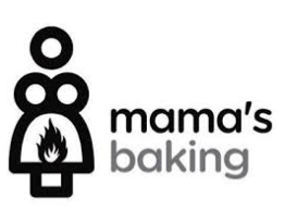
Let’s be real, the name “mama’s baking” probably didn’t do the design team any favors.

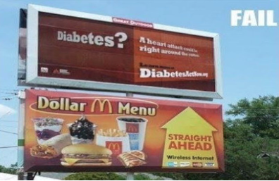
Definitely a tough choice.

If you can’t see the joke immediately, look closely at the heads and arms of the dancers.

To be fair, they didn’t claim to be auto care experts.

I’m glad we found marketers whose ads don’t beat around the bush.

Hey, can’t say they didn’t warn you.

A reminder of how important the ‘space’ key is.

Halls and Trojan are certainly targeting relevant markets with this one.

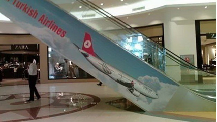
There’s nothing that would make me want to travel via Turkish Airlines more than an image of their plane headed downward in a 45 degree angle.


