CALL: 985-200-4333
The Effect of Color in Logo Design

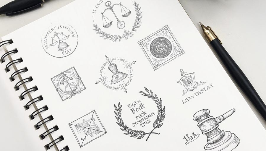
Do you notice anything about these logos? All of these restaurants incorporate Black, White, Red, and Yellow in their logo design. When it comes to identifying your brand, your logo is probably the first thing your customers will think of. There is a narrative and message that needs to be communicated through your logo, and although many logos are designed in black and white, they are quickly changed with color to convey a message. Human beings love colors. In Kindergarten, all children want to have thebiggest box of crayons or colored pencils. As we grow older, colors convey messages, evoke emotions and add character to everyday things.
Yellow
Yellow is the color of the sun, and it’s understandable that this color evokes feelings of optimism, clarity, and warmth. It also is synonymous with wealth because of its resemblance to gold and treasure. The most logical reason that companies incorporate yellow into their logos is that it can stand out even in the midst of busy surroundings. McDonald’s chose to use the giant yellow M to communicate a kid-friendly and inviting presence.
Other companies such as CAT, a leading brand in the construction industry, use yellow or a different reason: to signify safety and caution.
Orange
Orange stands out similarly to yellow by being eye-catching and evokes feelings of creativity, youthfulness, and enthusiasm. Hooters, Harley Davidson, and Nickelodeon use this color to draw in an audience in different ways.
Red
This color might be the most widely used color in logo design. Red raises people’s pulse rates but can convey many different emotions depending on its placement. It can be warm, sexy, exciting, or urgent. Netflix, K-mart, and Target use red to communicate a sense of urgency which may compel people to buy, While Coca-Cola takes advantage of red’s welcoming allure.
Purple
Purple is the color of royalty that gives the sense of grandeur, mysticism, and being downright fancy. Brands that utilize purple draw in customers that are looking for out of the ordinary experience. Examples of brands that use purple are Aussie, Hallmark, Yahoo, and Cadbury.
Blue
If you want to convey a sense of dependability, strength, and tranquility, then blue is your color. Technology brands such as Intel, IBM, and AT&T use blue to communicate trustworthiness, while the beauty world and medical brands use blue to make you feel at peace.
Green
John Deere and Animal Planet use green in their logo design for obvious reasons: their brands revolve around the earth. Green makes us feel a sense of peace and serenity, but it also could signify growth and health. Whole Foods utilizes green to draw the health concerned to shop with them.
Black and White
Colors have successfully been proven to elevate brands, but some brands have had a ton of success with sticking to black and white such as Nike. Black is visually dark has an association with power, authority, and strength. White is considered safe and open and linked to righteousness. Some products use black to simply match their product: such as Guinness.
Velocity Agency knows that a brand’s logo is one of the most important elements of their brand. Here at Velocity Agency, we unleash new ideas that spark conversations. Our team is dedicated to crafting creative designs that push your business and reputation forward. If you are looking for a dedicated team that will help develop your logo, look no further than Velocity Agency.


