CALL: 985-200-4333
Responsive Web Design Benefits | Velocity Agency | New Orleans
Mobile traffic has been a concern ever since the first mobile browsers came out, which could display links and small images on mobile phones. Today, Responsive Design has taken over and a new wave of improvements to mobile websites is underway. Modern websites can automatically fit any size of display and arrange content accordingly. Responsive design enhances the user experience and creates a perception that they are custom-designed for any device: tablet, smartphone, laptop, or desktop computer.
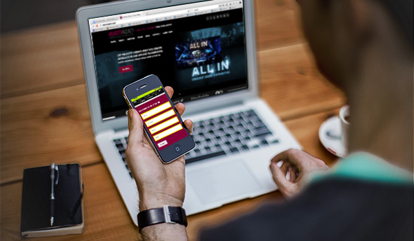
Some companies/brands, however, don’t fully understand the benefits of responsive design. Generally, this is due to a decision maker’s lack of understanding the importance of user experience. As responsive design has become baseline, these facts and statistics should do away with any doubt. ComScore reports that smartphones and tablets currently account for 60 percent of online traffic, which means your users will potentially access your website using one of these devices. Social media has grown exponentially on mobile devices, which is a great way for customers to find you online.
What Are The Benefits Of Responsive Design?
First, your customers will find it easier to navigate a website that has been optimized for mobile and tablet. There’s nothing worse than using a full desktop website on a smartphone; it is frustrating and leads to a high bounce rate. By taking the time to address different screen sizes, your customers will be happy to have easy access to menus and contact information, which directly translates to increased leads and conversions.
From an SEO standpoint, having a responsive website is a must. Last month Google started rolling out “mobile friendly” tags for websites optimized for mobile, which means customers will more likely click on search results with responsive design. The search giant is also giving higher rankings to mobile sites, which should be motivation enough for companies to go mobile. Therefore, the lack of responsive design on your website will negatively affect your click-through rate.
How Can You Find Out If Your Site Is Mobile Friendly?
There are several ways to test this. First, to see if Google recognizes your website as mobile, try out this tool. Simply drop in your link and after a few seconds you’ll get the results. Second, from your desktop computer, manually resize your browser’s window. If the website reacts to the change in size and the images and text resize accordingly, then the site has been optimized. Finally, experiment with accessing your website from different mobile devices; this is the ultimate test.
How to Fix It?
This is where Velocity Agency can take your web presence to the next level. With expert web designers and back-end developers in-house, we work effectively and efficiently for our clients. The proof is in the pudding; our product and track record speaks for itself. Whether you need your first website, a website re-design or a complete overhaul, we will immediately improve the user experience. As a byproduct, we will maximize your search ranking, click-through rate, leads, and conversions (increased top-line revenues). Take a look at our work and contact us to see what our team can do for you.
–
Velocity Agency is a digital marketing and advertising firm specializing in digital and internet marketing & advertising, print, web design, graphic design, film, and HD video promotion and post-production. Velocity serves clients all over the United States from our Metairie, LA office just outside of New Orleans by strategically implementing proprietary tools and techniques to get you the most conversions for your business through lead generation, cost-per-acquisition, and top line revenue.


